In the “Banner Content Carousel” section, you can customize the content by adding blocks, buttons, and a header. There is no limitation on the number of blocks you can add, giving you the flexibility to include as many blocks as needed for your carousel.
However, it is recommended to add only 4-5 blocks because it is a carousel. Adding too many blocks may overwhelm viewers and make the content difficult to navigate. Keeping the number of blocks limited ensures a better user experience and avoids visual clutter.
You can add blocks by clicking on “Add block”:
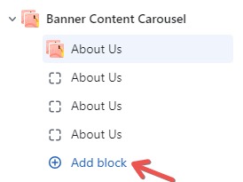
After that, to edit within each block, follow these steps:
- Click on the “About Us” option located on the left-hand side.
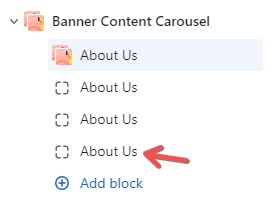
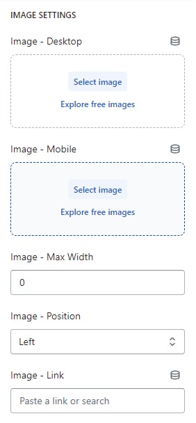
Image setting
Firstly, in the “Image setting” part, you can add custom images and edit them to fit both desktop and mobile displays. You also have the option to customize the width and alignment (Left, Center, Right) of each block. Additionally, you can make the images clickable by adding a link in the “Image – Link” field. This way, users can interact with the images by clicking on them.
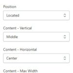
Content – Setting
Next, in the “Content – Setting” part, you can easily customize the content’s position and width by clicking on “Position,” “Content – Vertical,” “Content – Horizontal,” and adjusting the width with the blue dots.
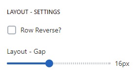
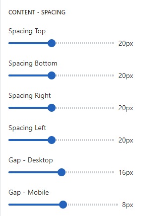
Content – Spacing
In the “Content – Spacing” part, you can customize the spacing above, below, right and left the content by adjusting the blue dots on the toolbar. You can also tailor the spacing to display appropriately on both desktop and mobile devices for a seamless experience.
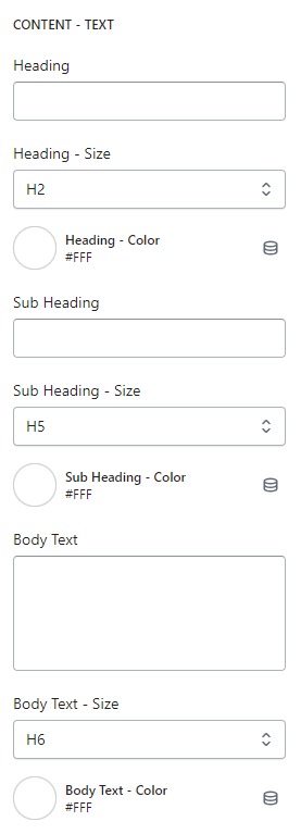
Content – Text
To add or edit the displayed content, you can do so in the “Content – Text” part. You will enter the content for Heading, Sub Heading, and Body text into the respective fields. After that, you can adjust the font size of each content by clicking on “Heading – Size,” “Sub Heading – Size,” and “Body Text – Size.” You can also change the text color by clicking on the respective fields: “Heading – Color,” “Sub Heading – Color,” and “Body Text – Color.”
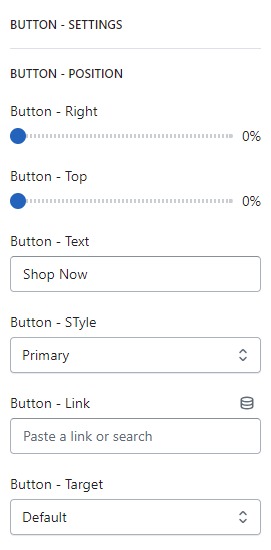
Button – Setting
Finally, in the “Button – Setting” part, you can customize the button’s spacing by adjusting the blue dots on the toolbar. To add content to the button, enter text in the “Button – Text” field, and then adjust the font size by clicking on “Button – Style.” Furthermore, you can add a link or navigate to another page by clicking on “Button – Link” and “Button – Target” to customize the button’s functionality. These options provide you with full control over the appearance and behavior of the button.
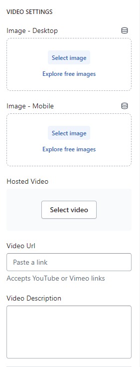
Video Setting
Additionally, in this section, there will be a “Video Setting” part where you can:
- Add a video: You have the option to upload a video or embed an external video link (e.g., from YouTube, etc.).
- Customize Thumbnail: You can edit the thumbnail image for both desktop and mobile displays.
- Add Video Description: You can include a video description to provide context or additional information about the video content.
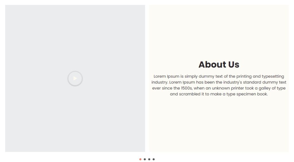
With these options, you can enhance the “Banner Content Carousel” section by incorporating engaging video content and relevant descriptions.